
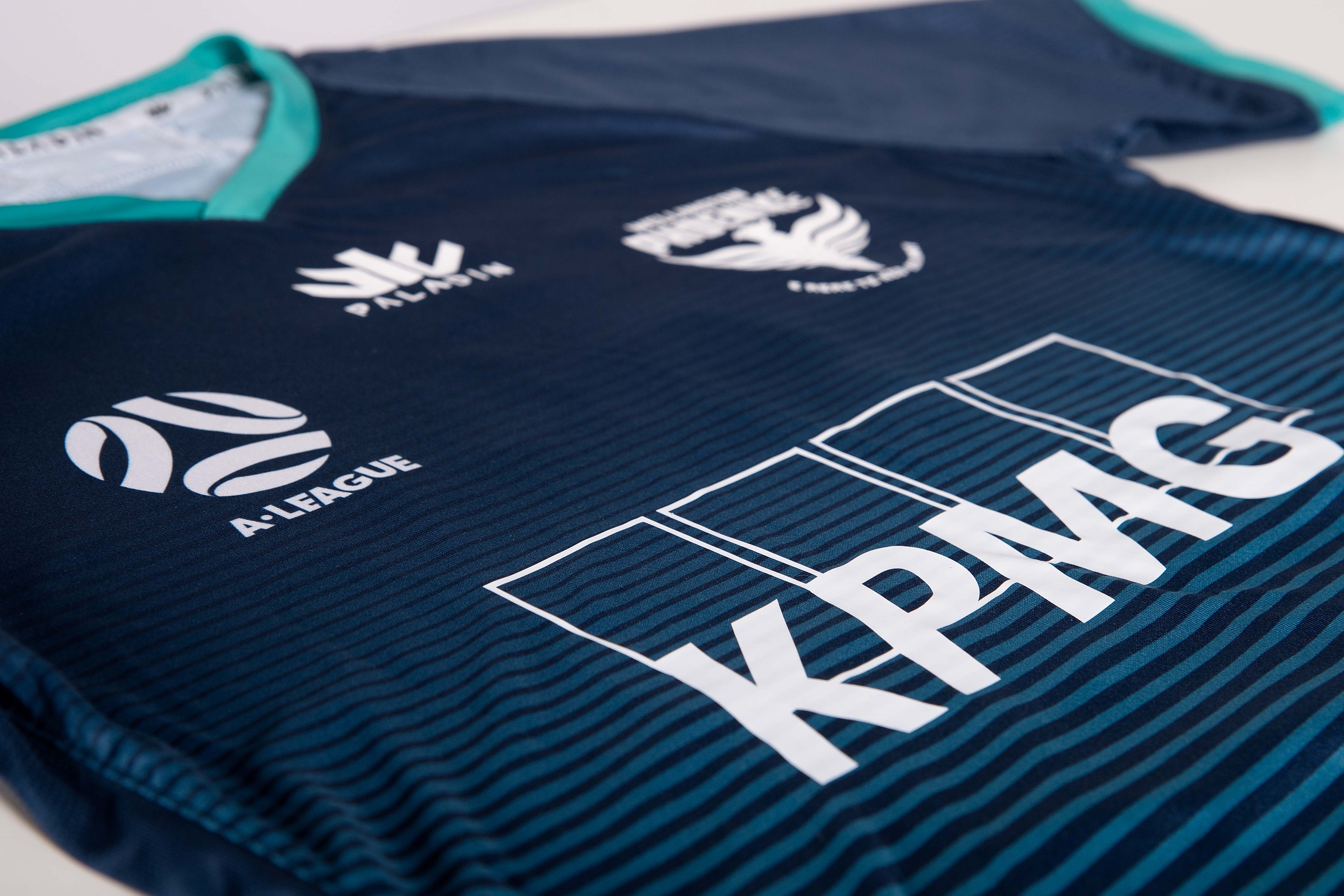
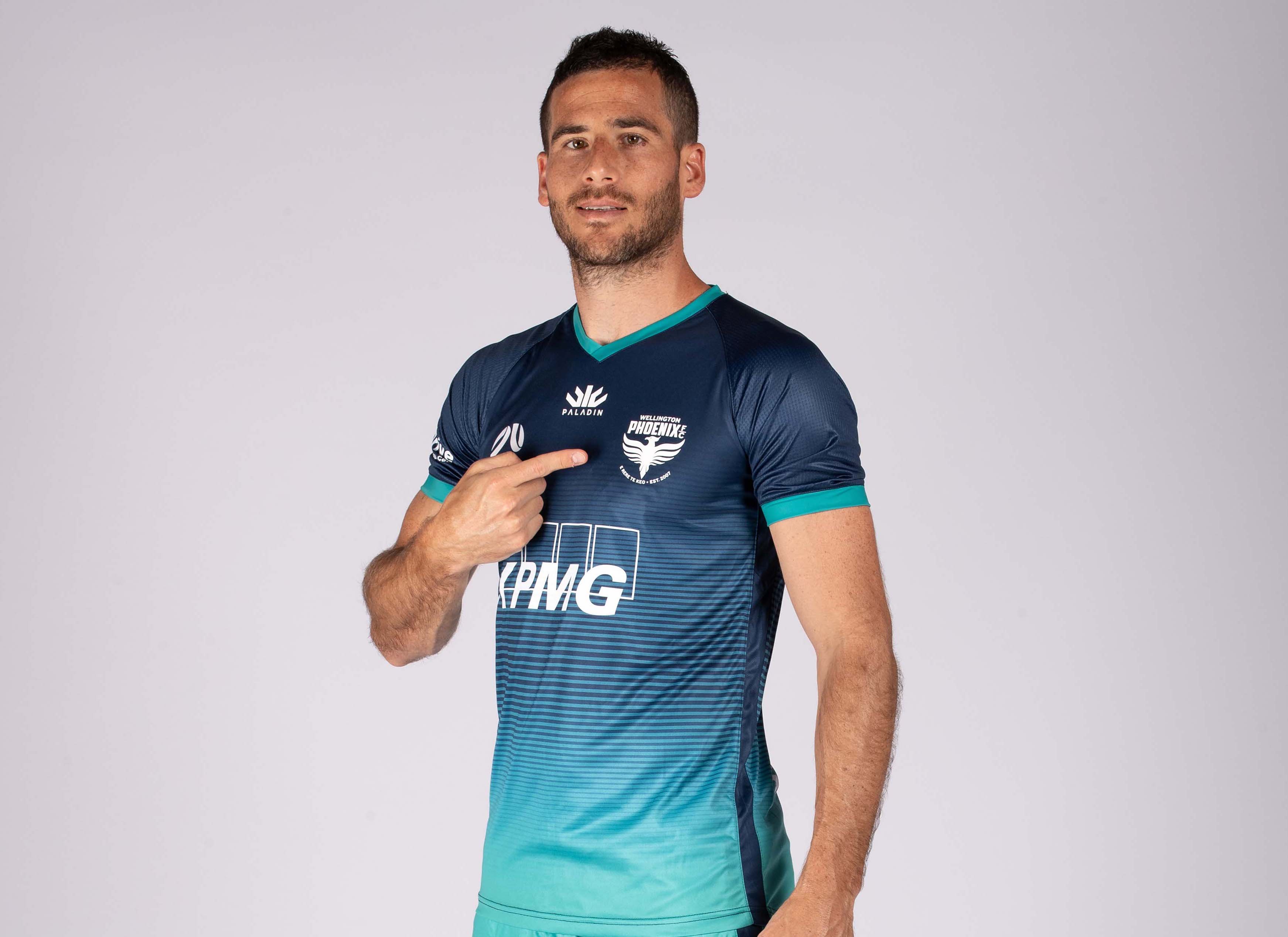
The Wellington Phoenix have today released a stunning new away kit for the upcoming 2020/21 A-League season, with players set to wear an all-blue playing strip – for the first time in club history – in its first away match against Macarthur FC tonight.
READ: Wellington Phoenix Partner With Fraternity Club in Wollongong
GALLERY: Training Preparations for Match Week 3 Fixtures Against Macarthur FC
READ: Wellington Phoenix Welcome Unbundling Announcement
I’m confident our fans both in New Zealand and Australia will love it, not just for how it looks but for the story and symbology behind it – this is part of our team’s mana and helps give us strength.
As with the home kit launched earlier this season, the away kit pays homage to the club’s New Zealand origins as it bases itself in Wollongong, Australia for the season.
Designed by Paladin Sports, the distinctive kit deviates from the traditional Phoenix yellow and black colours by introducing a graduated blue and aqua colourway – with the design again drawing on the story of Ngake and Whataitai, the taniwha of Wellington harbour in Māori mythology.
Wellington Phoenix General Manager David Dome, says that while the home kit drew on the geography of Mount Victoria which overlooks Wellington Harbour, the away kit instead focusses on the harbour itself.
“Last season during the club’s cultural awareness day, the players were given the rare opportunity to paddle a Waka (a traditional Māori canoe) out into Wellington Harbour,” says Dome.
“In the process they learnt how Māori relied on strong teamwork and communication many years ago to pilot these Waka, and how the story of Ngake and Whataitai – who legend says lived at the bottom of the harbour – has been integrated into the Wellington Phoenix’s origins and beliefs.”
“It was a very special day for them, and for myself, so to see this journey symbolised in our away kit is very important, very special to our club.”
The Wellington Phoenix drew upon the story of story of Ngake and Whataitai – with the phoenix in their name being used as a representation of the spirit of the taniwha when the club was first conceived.
The legend tells of both taniwha living in a lake, which they desperately wanted to break free of to enter the nearby ocean. While Ngake escaped Wellington harbour using brute force to burst through the harbour mouth, Whataitai took a different approach and became stranded; its wairua (spirit) leaving its body to fly to the top of Matairangi (Mount Victoria) in the shape of a giant, Phoenix-like bird.
In deference to this story, the Wellington Phoenix uses the rallying cry of “E Rere Te Keo” which symbolises the type of cry that Ngake would have used as he built momentum to burst through the hill – and into the ocean beyond.
Dome says that while this is a break from the club’s traditional kit colours and design, it is a bold move for the club as it explores new ways to represent its brand.
“I’m confident our fans both in New Zealand and Australia will love it, not just for how it looks but for the story and symbology behind it – this is part of our team’s mana and helps give us strength.
“We want our players to harness that same energy and determination that Ngake had – when he used brute force, speed and determination to escape his prison in Wellington Harbour – whenever they wear this kit.
“And even though we’re based in Wollongong this season, it’s important for our kit to symbolise our connection back to Wellington and Aotearoa, where we left fans and family behind.”
The away kit jersey will be made available for purchase at a later date.