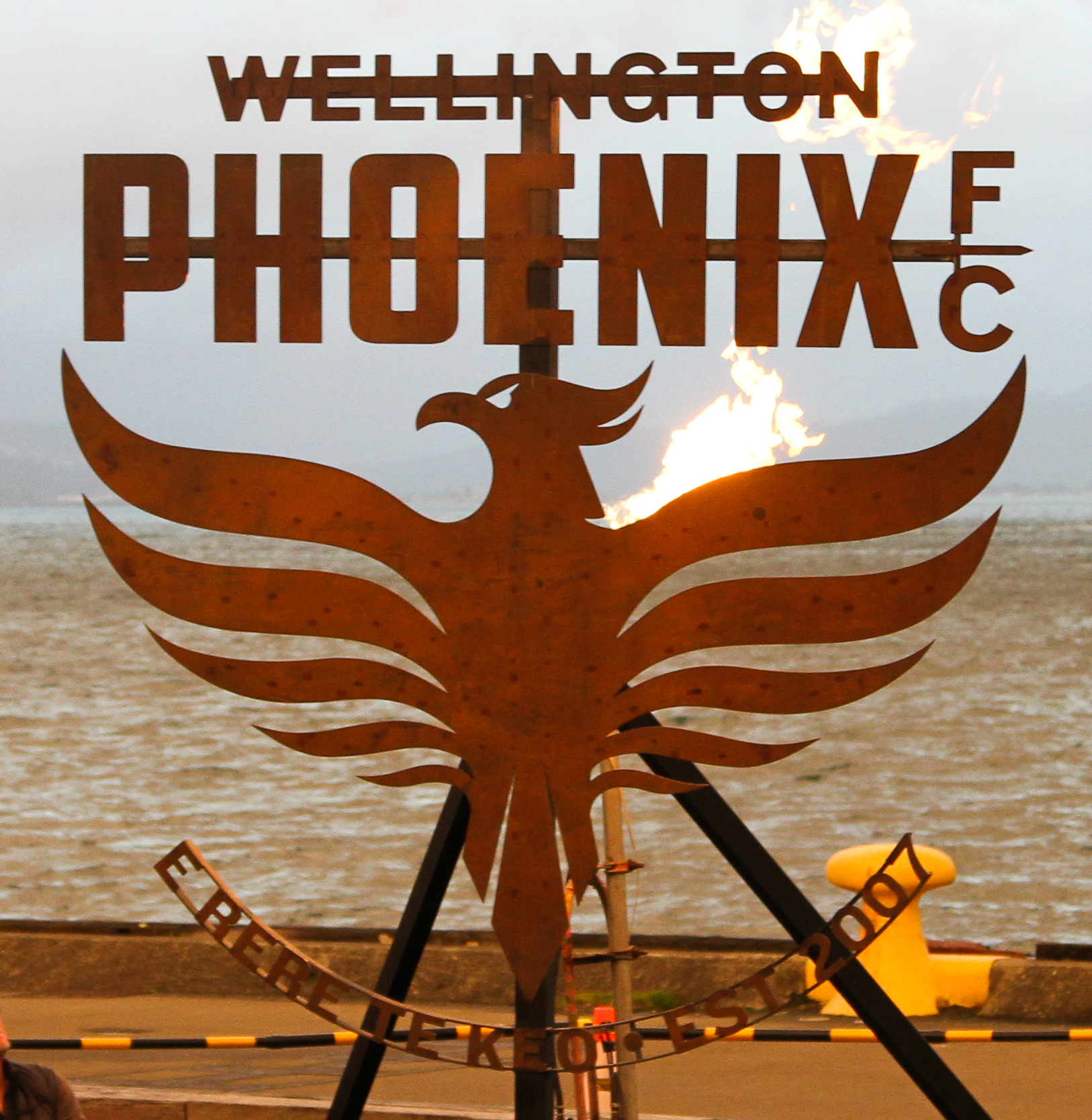
As we enter our second decade Wellington Phoenix are excited to unveil and launch our brand new tohu or logo, a symbol of future aspiration for the club, anchored in the rich history of Wellington, its people and its geography.
With the inclusion of the Maori inscription ‘E Rere Te Keo’ and the representation of the Phoenix-like spirit of the taniwha (a great water monster of Maori mythology) the club is both celebrating New Zealand’s genuine commitment to biculturalism, but also anchoring itself in a uniquely Wellington story that provides clear guidelines as to the culture and identity of the club moving forward.
The story of Ngake and Whataitai, the taniwha of Wellington harbour.
Wellington has layers upon layers of stories and history. The words ‘Te Keo’ relate to Matairangi (Mt Victoria) and the legend of Whanganui-ā-Tara (Wellington Harbour). The background to ‘Tangi Te Keo’ is the creation of the harbour.
The story is based around two taniwha, Ngake and Whataitai, that take different approaches to the same challenge. The taniwha lived in a lake, the challenge was to break free of the lake and make it into the ocean. The goal therefore was to find a way to the ocean.
First to attempt a break out was Ngake, he prepared himself by swimming round and round the lake gathering speed, he then coiled up his tail, pushed off and burst through the Harbour mouth.
Whataitai on the other hand attempted to simply break through at the weakest point; he had no preparation, built no speed and consequently became stranded.
Ngake achieved his goal whilst Whataitai became stranded and turned from a taniwha into a hillside. It is said that the wairua (spirit) of Whaitaitai left its body, flew to the top of Matairangi (Mt Victoria) in the shape of a bird and proceeded to tangi (weep and mourn). The top of the hill is still known as ‘Tangi Te Keo’.
By contrast, ‘E Rere Te Keo’ is a rallying cry, the type of cry that Ngake would have used as he built momentum, the kind of cry he may have used as he burst through the hills!
The lessons of Ngake and Whataitai are pertinent today, especially for the Wellington Phoenix.
‘E Rere Te Keo’ is the resounding call or the rising call – the call to prepare, the call to work hard, the call to prevail regardless of circumstance.
Harken to the call of the Phoenix. Get behind your team as they prepare to take on all challenges with the resilience, persistence and fortitude of Ngake!
The new tohu (logo) takes inspiration from Ngake and embraces the local historical narrative by celebrating the past and acknowledging the role of local tangata whenua (people of the land). The central concepts are mana (respect); kaha (strength); whanau and iwi (family and tribe). These central concepts are important as the Phoenix honour the past, acknowledge the present and create their future.
The inclusion of Māori culture is a start to celebrating the diverse cultures associated with the Phoenix.
[Story prepared by Neavin Broughton, Cultural Engagement Facilitator, Wharewaka, connected to local Iwi]

For Club Ambassador Ben Sigmund, a legend of eight seasons with Wellington Phoenix, the new logo symbolises a wider project of rejuvenating and cementing the club’s identity and internal culture.
“For me, the strongest aspect of this new logo,” said Sigmund, “is that it draws upon a story, a story specific to Wellington, that is based upon key values that we want to build this club around.”
“We want to live and breathe these values. The cautionary tale of the two taniwha and its lessons – a story of hard work not laziness, of perseverance not giving up, of facing adversity and always absolutely giving it your all.”
“It’s so important that everyone at this club, the players and staff, but also the fans, that we understand who we are and what we stand for – so that whatever the players are doing on and off the field, they are representing this club with pride and passion.”
For General Manager David Dome the new logo offers an opportunity both for reflection, but also celebration.
“With this new logo, with its inscription and depiction”, said Dome, “we’re looking not just forward to the type of football club that we’d like to become, but also reaching backwards; acknowledging the rich history and connection to place of tangata whenua.”
“This crest signifies fortitude, resilience – a sense of mana [respect] or kaha [strength]. Qualities that typify Wellington, a city buffeted by blistering winds, rain and the ever-present threat of earthquakes.
“It’s important to note however that this is just the beginning of a journey, a journey started together and in consultation with local Iwi. We’re not about to start doing hakas before games, or trying to pretend we’re something we’re not.
“But we are going to say to the people of Wellington and New Zealand that this football club wants to show more character, to represent them with respect, and honour.”
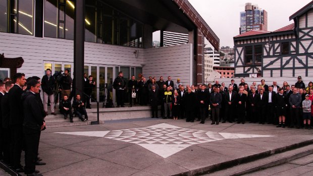
A 3m x 2.4m steel representation of the new crest was formally unveiled in a dawn ceremony in front of the Wharewaka, a significant culture landmark on the Wellington harbour, in front of more than two hundred fans, guests and the entire staff and playing group of the Wellington Phoenix.
The new logo will officially come into place from Thursday 10 August 12pm (NZT) / 10am (AEST).


